Are You Ready?
This year we have seen several major changes in search that indicate that Google is shifting from a desktop-based search engine to a mobile-first one. Although mobile has been a dominant platform for a few years already, 2017 will be the year that Google will place the needs of mobile users before that of desktop users.
Every business should already have a website that passes Google’s mobile-friendly test – if your website is not mobile-friendly, you must develop a new website as a matter of urgency. However, for many websites, being classified as mobile-friendly is only the first step in winning in the new mobile SERPs.
Google has announced plans to launch a new search engine algorithm that will rank websites in accordance with their mobile friendliness. This has been dubbed Mobile First search, and there have already been reports of this being tested in the live search environment in America. Last month, some businesses saw a dramatic fall in Google referrals during the test, and this is certainly a sign of things to come for businesses that are ill-prepared.
Google hasn’t confirmed whether or not it will still run a desktop search engine for PC users, but it has said that for mobile users, which we assume includes tablet users, they will display a new search index that will largely exclude websites that are not mobile optimised. Let’s take a look at what will be needed to outperform your competitors in 2017.
Pass Google’s Mobile Friendly Test
The first step is to test your website using Google’s mobile-friendly testing tool. Just enter your website into the search bar and Google will analyse your site for mobile friendliness. If your site passes the test you can move on to the next step – well done!
If your site fails, you will see something like this:
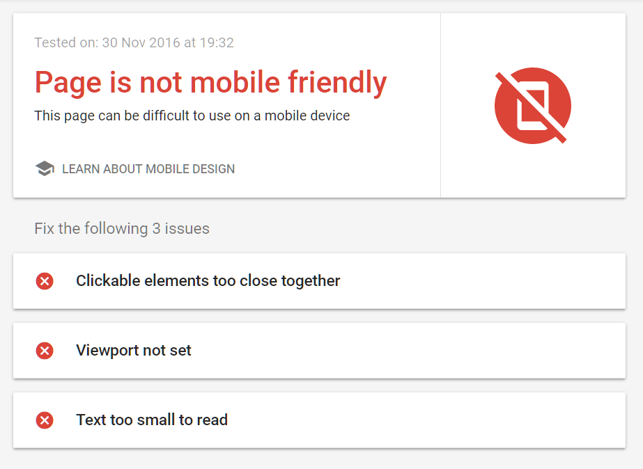
All you need do is fix the problems that Google has highlighted and re-test. In many cases, especially if your website is rather old, the only option will be to build a new website.
Be Responsive
Although a responsive website is not the only option, it is considered by many to be the best option. A responsive website is one which adjusts its width automatically to match the size of the screen (viewport) it is being viewed on. Responsive sites are now preferred over mobile-specific websites – they are also better for SEO as we do not need to worry about canonical issues and redirects.
Be Fast!
Being mobile-friendly is not enough, your site must also be lightning-fast. Studies have shown that websites that take more than 3 seconds to load are abandoned around 50% of the time. Google’s latest suggestion is to aim to load in around one second on mobile devices – ideally faster.
In 2016, Google rolled out Accelerated Mobile Pages (AMP) to all types of websites, and it is already displaying AMP versions of pages in the mobile search results. AMP websites are cached on cloud servers to dramatically speed up delivery – some tests have seen web pages load in 100ms. However, speed does come at a cost – AMP pages can only use authorised javascript and this is a big challenge for web designers. But, if you are running a WordPress website you are in luck – our web developer will be able to help with setting up AMP pages for your site.
Cut Out The Dead Wood
It is possible to speed up an existing website without resorting to AMP, however, this does involve trimming down your website. On mobile people rarely view sidebars and footers, so these should be cut back as much as possible, and ideally deleted altogether. With responsive websites, the sidebar usually gets pushed down below the main content, effectively becoming a first footer, with the main footer below.
People very rarely swipe down to the bottom of the page to seek more information. The solution is to create useful resource pages that can easily be found in the main site navigation – it is better to display the information once, rather than repeat it across every page.
The Changing Nature Of The Internet
Mobile first search is actually good news for SMEs, as it does not take a huge investment to launch a new, mobile friendly website. However, for more established websites that rely on advertising, it will pose a huge challenge. We have already seen an increase in the use of ad blockers, which has hit the profits of many information-based sites, and ad-heavy pages also take a long time to load. Many news sites are likely to see their advertising revenues fall when Google stops delivering readers to their sites.
For instance, pages on tabloid news sites such as the Daily Mail can take over 30 seconds to load. These pages are loaded with images, videos and adverts, which perform very badly on mobile devices.
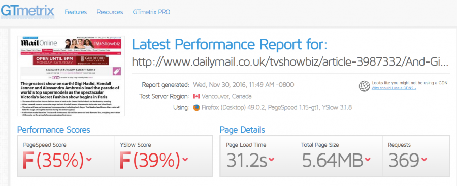
Local news sites also suffer in a similar way. Sites such as Essex Live, which have essentially replaced the centuries old Essex Chronicle newspaper, rely on advertising to survive. But these ads slow the site down, which may reduce search visibility. Essex Live is even slower than the Daily Mail, so much so, GTMetrix gave up analysing it after two minutes!

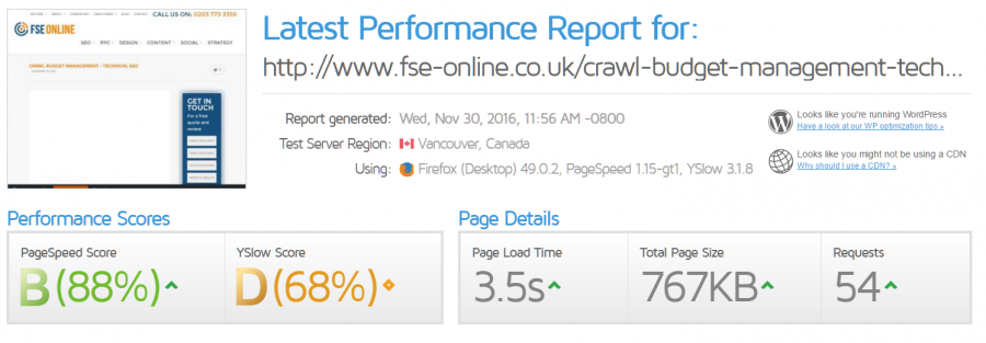
We have not yet fully optimised our own website, but as you can see, it loads much faster and has significantly better performance scores than the Daily Mail:
So, 2017 will be the year of a truly mobile first Internet. When Google fully rolls out its new search engine algorithm we may see many once popular sites literally vanish from search, while newer sites and business that operate fast, mobile-friendly sites, rise to the top. It will be an exciting year for SEO and web developers.
If your website is not performing well in mobile, get in touch with FSE Digital today – our web developers and technical SEO consultants will ensure that your website receives high performance ratings and top speeds to maintain those all-important page one search positions.
